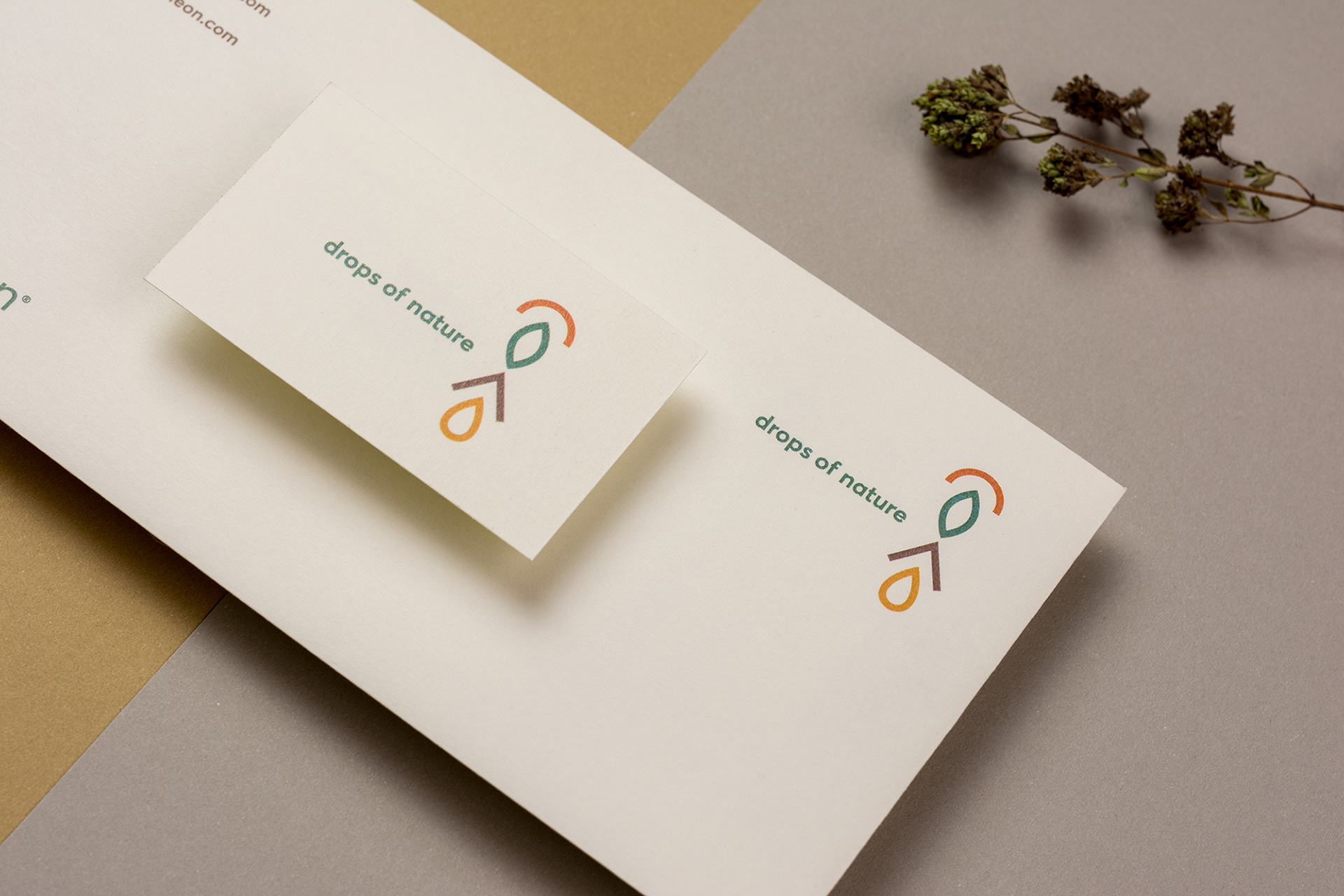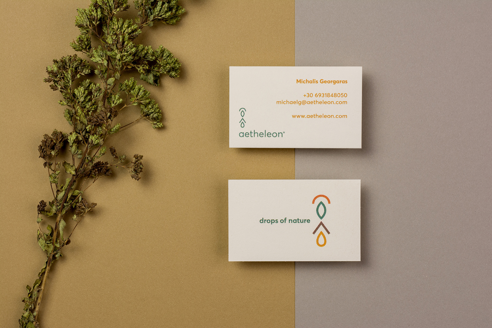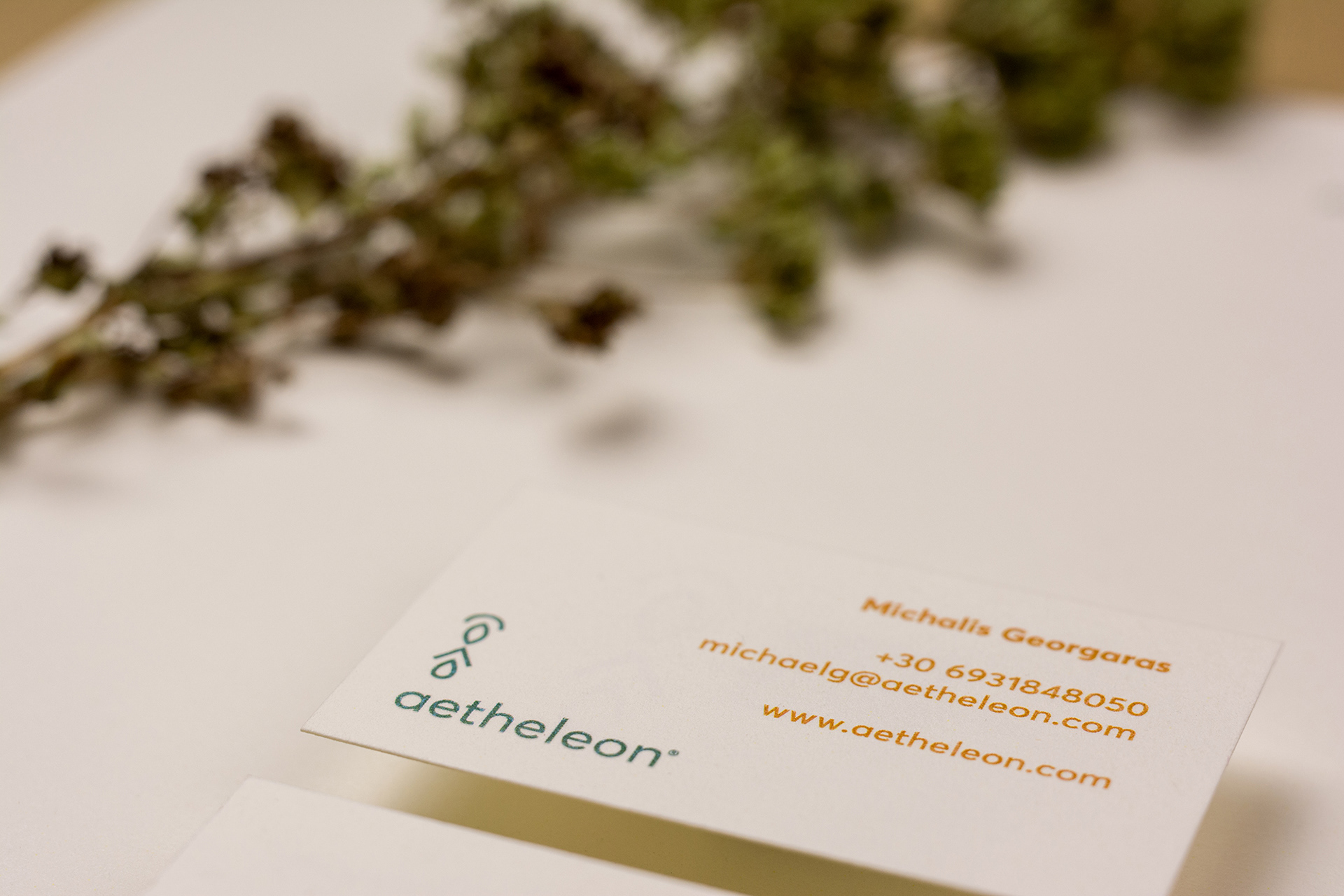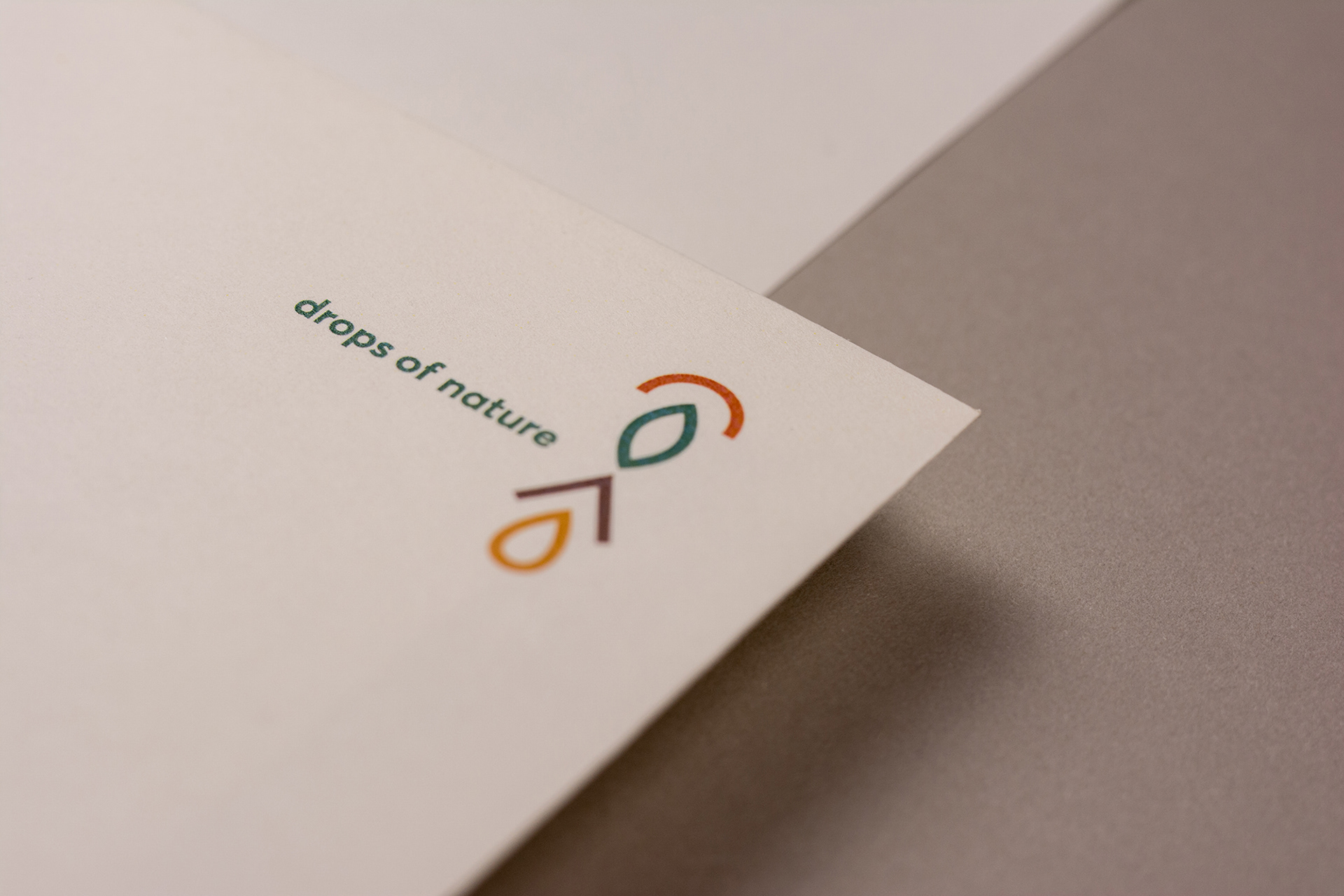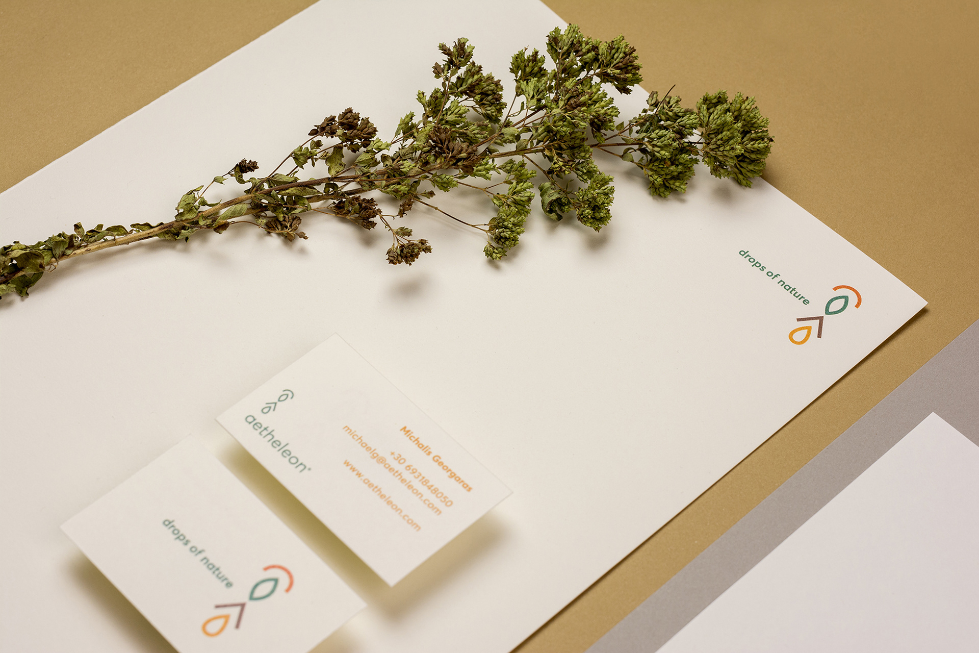

Aetheleon is a new company based in Thessaloniki/Greece active in the field of organic herb products, especially oregano. They offer a variety of products, such as essential oil, flower water and dried herbs. High quality organic products and continuous improvement using all technological tools available with respect to tradition are some of the company's principles. Aetheleon asked for a logotype and a visual identity reflecting these values. The concept and design we delivered is mainly based on the etymology of oregano (oros "mountain" + ganos "brightness") but also on what the company produces. Clean typography is used to complement the symbol. Materica Limestone recycled paper was used in all printed material.

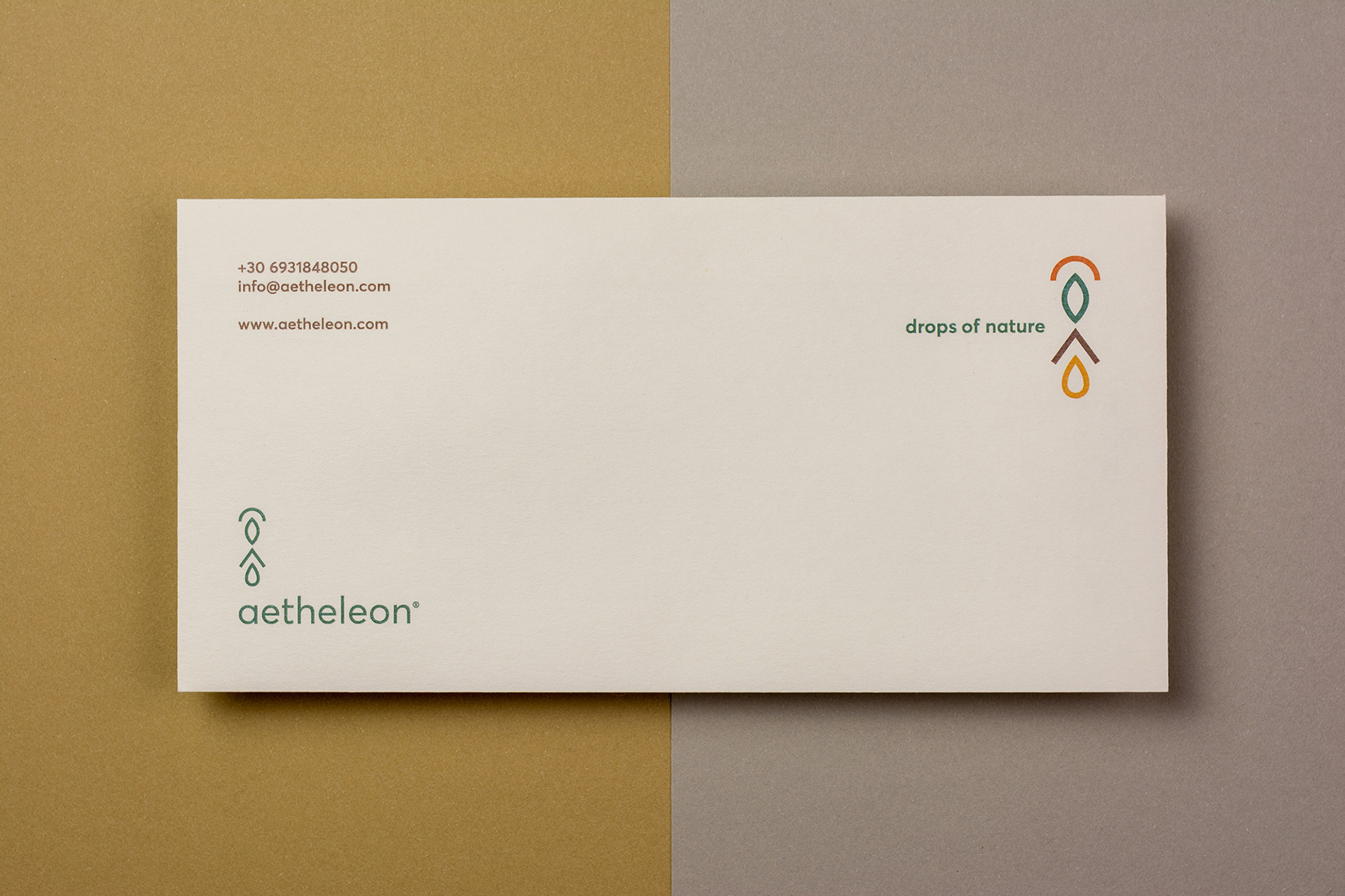
The concept behind symbol, color palette and tagline.

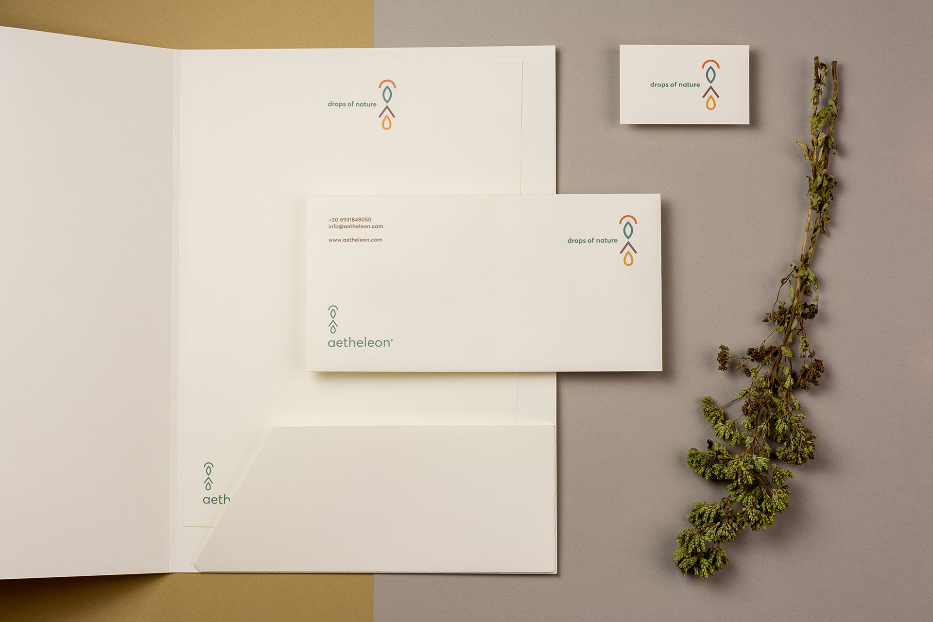
The logotype adapts to its environment depending on its position on the composition.